ARCHE Branding & Packaging

Project Details
ARCHE is a refined kitchenware brand built around intentional design, simplicity, and everyday beauty. For this project, I created a cohesive visual identity and packaging system that reflects ARCHE’s core values — precision, beauty, usability, and longevity — while positioning it as a premium, design-led product line.
Brand Design
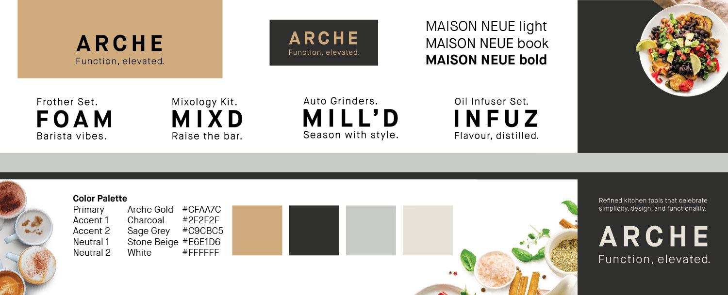
The ARCHE identity is clean, modern, and timeless. The primary logo is a spaced, all-caps sans-serif wordmark, typography choice Maison Neue, brings geometric clarity and understated elegance. The colour palette is grounded in Gold, Soft Charcoal, Sage Grey, and Stone Beige, with brushed gold accents to convey premium quality. Photography direction focuses on soft, natural lighting and real kitchen environments, keeping the mood calm, minimal, and inviting.
Packaging Design
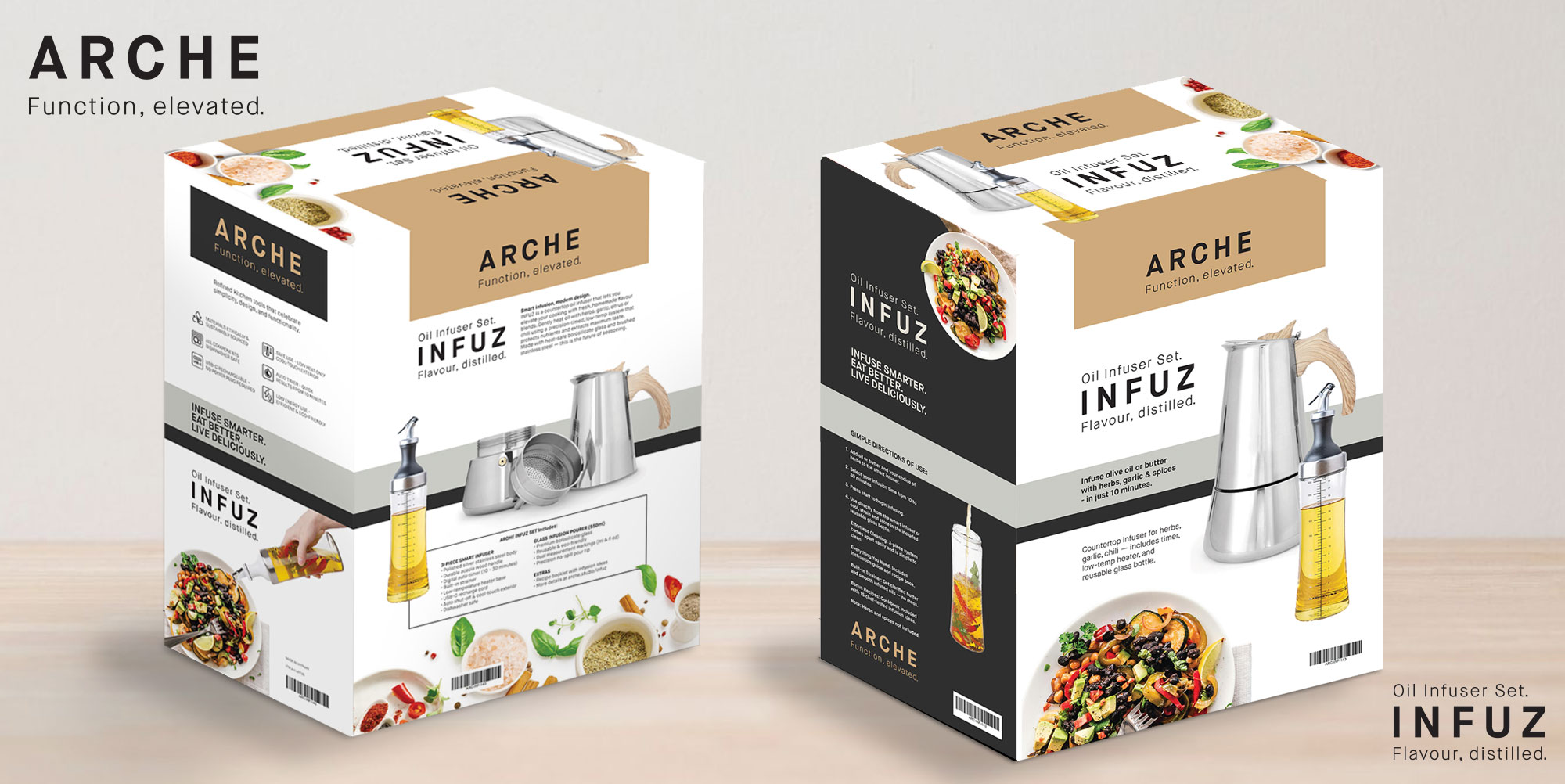
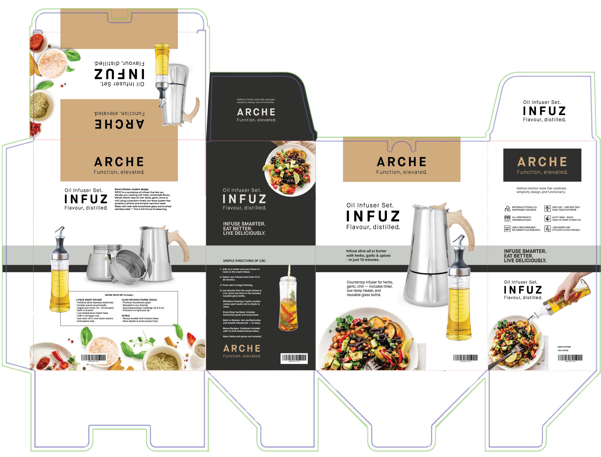
The ARCHE INFUZ packaging was developed to reflect the product’s elevated function and modern form. The matte-finish board is paired with embossing, spot UV, and foil stamping to create tactile moments of interaction. The layout applies generous white space, balancing clean visuals with concise, benefit-driven product copy. Iconography communicates features quickly, while the tone of voice keeps technical information approachable. The ARCHE identity and packaging create a brand presence that feels equally at home in high-end kitchen boutiques and on aspirational lifestyle shelves.

